WAYV
Riverside Office Tower
Brand development and brand campaign
- Type of project
- Office tower
- Location
- Offenbach am Main
- Client
- Eyemaxx Real Estate Group
- Disciplines
- Strategy, positioning, name development, logo, brand development, image concept, supervision rendering process, construction fence and flags, landing page, website, digital presentation, media and public relations, give-aways


Name and brand
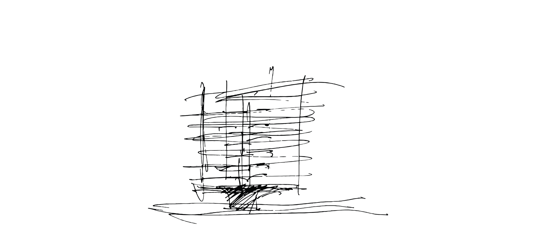
WAYV combines the two words “wave” and “way” to create the artificial name WAYV. In this symbiosis, WAYV merges various distinctive features of the new office tower into a new identity: the water location (on the river, in motion), the shape of the building (multiple bends), the various building lines and thus the connecting element that the tower occupies in form and function at Offenbach harbour. WAYV stands for a dynamic office high-rise that brings a new quality to the multifaceted micro-quarter of the harbour.
The shape of the logo in high letters illustrates the height and elegance of the building and at the same time the strong momentum of the seemingly endless lines that run around the building. The flowing water and the location on the river Main is also cited in the form. The font used, Söhne, is a modern interpretation of the classic Akzidenz-Grotesk typeface, combined with elements of the Helvetica typeface. It embodies the contemporary character of a new-generation office tower.
The WAYV Office Tower stands pointedly and succinctly as a landmark at Offenbach harbour and embodies a new self-image. In this attitude, the definition of the quality of the location and the affiliation to the building’s class merge to form the strong, positioning subline RIVERSIDE OFFICE TOWER.
Monochrome colour schemes of black, white, grey and restrained light natural tones demonstrate coolness, courage, conciseness as well as modernity and underline the significance of WAYV as an expression of future-oriented entrepreneurship.

Imagery and supervision visualisations
In order to convey the image of WAYV as a high-rise office building of a new generation and to make the product tangible for potential tenants, users and multipliers, acre developed strong visual worlds in cooperation with bloomimages, Hamburg, which demonstrate the qualities and the location of the building.
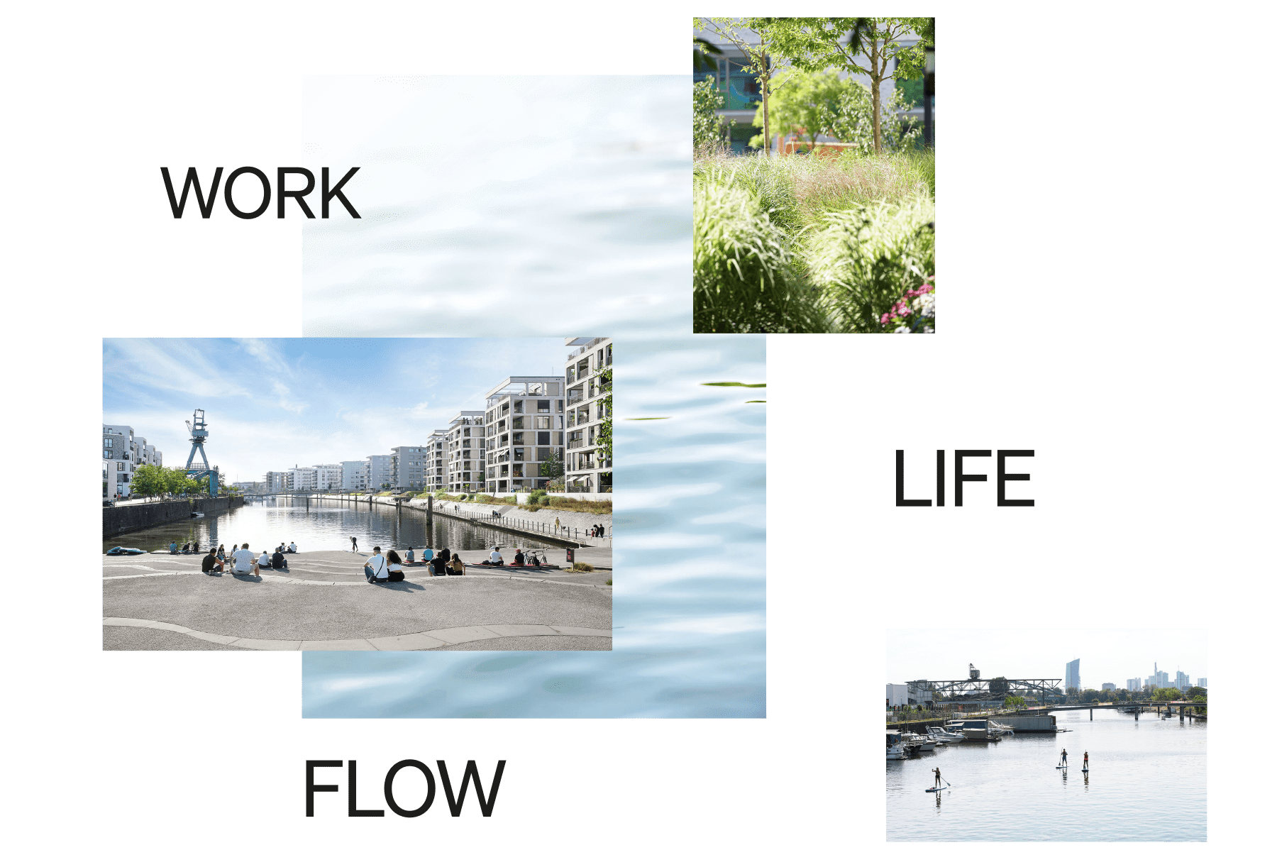
Imagery surroundings

Website
On its project website, WAYV presents itself in a striking, minimalist design, with the atmospheric visual language coming into focus, supported by gentle parallax effects. The intuitive navigation guides users through the site. Visitors to the website will find all relevant information on the building and its usage concept, office spaces and location, as well as the offerings and lifestyle of its surroundings, embedded in a stringent user journey. In this way, the website combines an attractive user experience with search engine optimisation, responsive on all end devices.
Digital marketing presentation
To support the blackolive real estate team in their sales talks, acre developed a digital, animated presentation. WAYV’s architecture and usage concept, its location and environment, as well as the numerous options for office space design are brought to life in the animated browser-based presentation.


Site hoarding boards and flags


Give-aways


