Brand development for the sustainable office tower UNIQ TOWERS
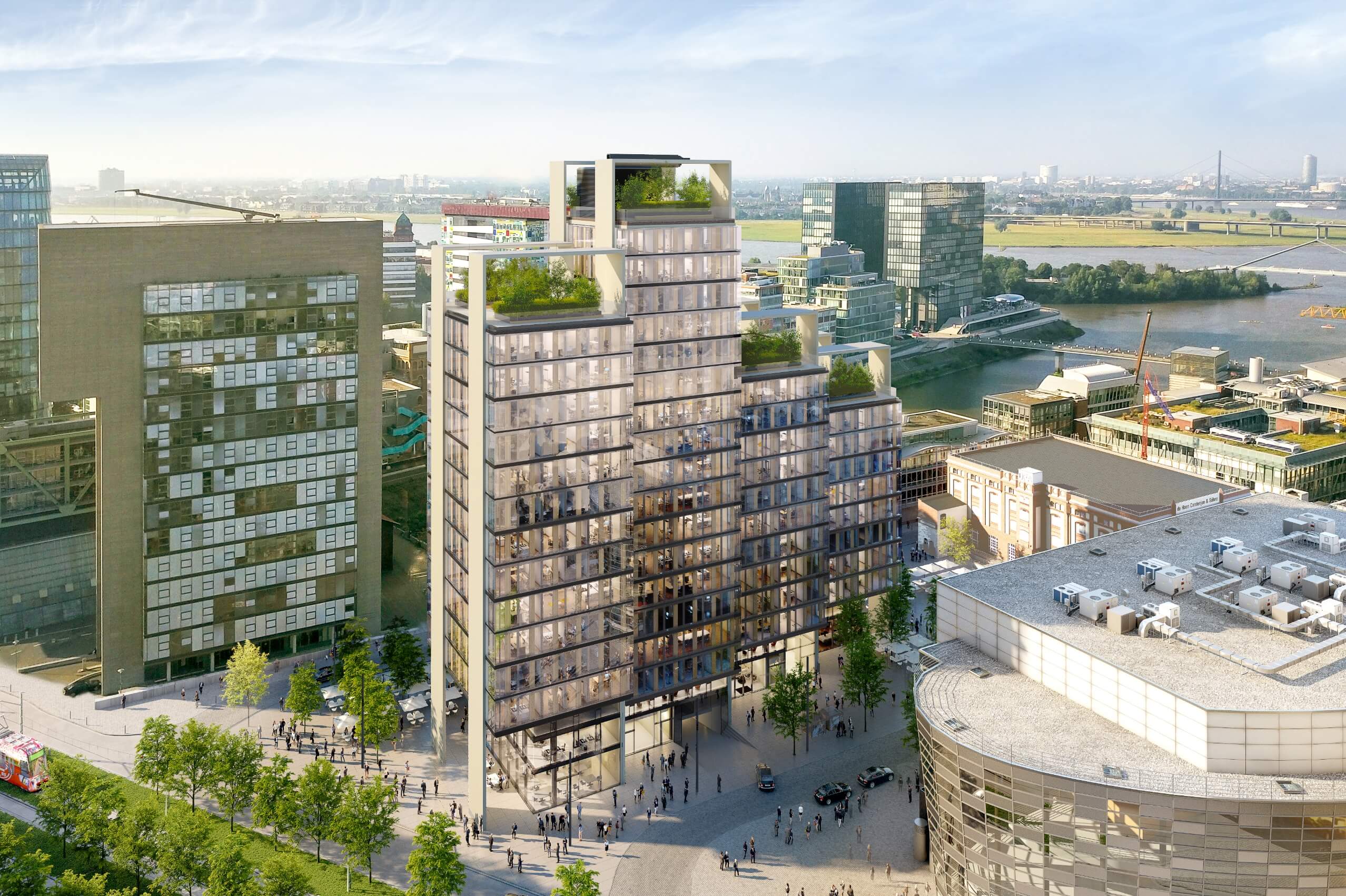
With the UNIQ TOWERS in Düsseldorf's Medienhafen, a central landmark for new work is being created. The high-rise office building with four towers, planned in accordance with the so-called supergreen® principles of the renowned architecture studio ingenhoven associates, the project is being created and realized by the investor MOMENI Group. acre created the name, the brand and the appearance for this unique project. The UNIQ TOWERS are being developed with cradle-to-cradle and supergreen® principles in mind, and with the goal of LEED Gold and WiredScore certification. On behalf of the MOMENI Group, the task was to develop a brand identity that on the one hand conveys the durability, quality and progressiveness of the modern office tower and on the other hand appeals to a demanding target group of office users.
read more- Type of project
- office, hospitality, retail
- Location
- Medienhafen, Düsseldorf
- Client
- MOMENI Group
- Discipline
- Name development, brand development, trademark application (DPMA), logo, corporate identity, imagery, floor plans, brochure, website, SEO, construction site branding
Name and brand development
The name UNIQ is derived from the English word “unique” meaning “one of a kind”. The shortened form UNIQ refers to the building’s ambition in being a unique and thus individual product for tenants and visitors regarding its form, perspective, quality and its sustainability concept. – an original that faces the future. The four letters U N I Q also refer to four towers that together form a unit.
Elegant signet for an ensemble of buildings with personality
The side view of the towers shows the distinctive architecture of the four towers. This momentum is reflected in the UNIQ TOWERS logo. The sans serif typeface used, Founders Grotesk, is inspired by classic grotesk typefaces of the early 20th century, which merge in a modern interpretation to create a contemporary typography.
UNIQ means creating something new by revisiting proven approaches.
Reduced color concept
The powerful yet timelessly elegant color concept is characterized by high-contrast black and gray tones, complemented by metallic, beige and natural tones that emphasize warmth and lightness as well as ambition, feel and quality.
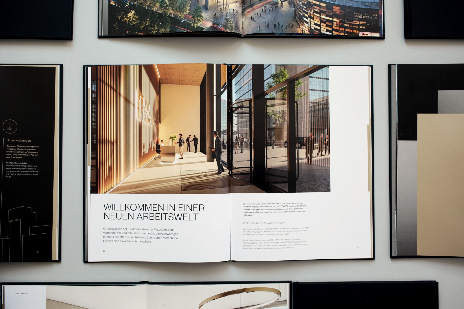
Noble marketing book
The UNIQ TOWERS brochure is of particular importance as part of the marketing strategy. High-quality materials, a restrained design, large-format premium renderings, the use of PANTONE metallic colours as well as the use of pictograms and maps draw attention to the essentials: UNIQ TOWERS as the best product in Düsseldorf’s current office market.


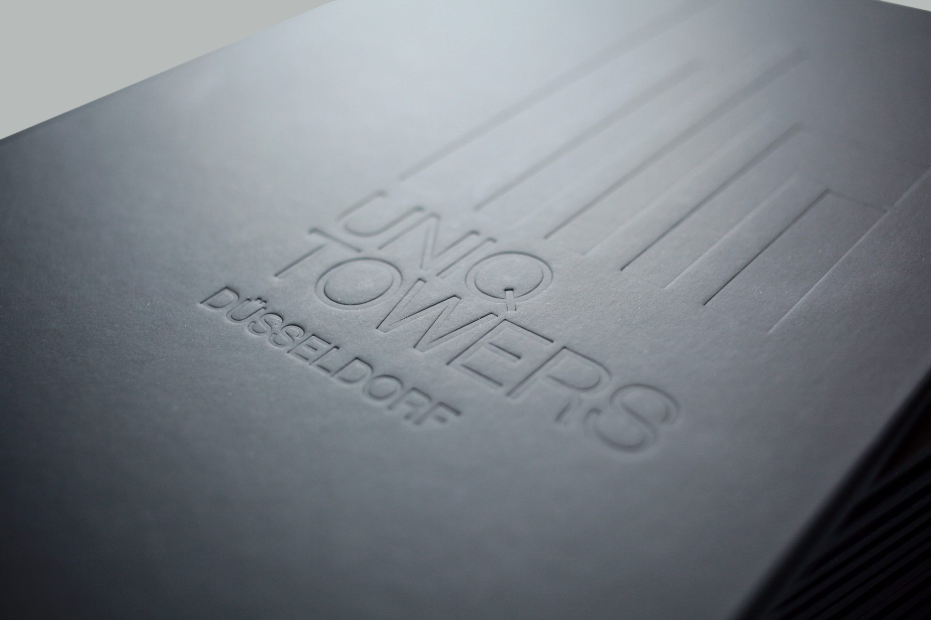
Finest finishing with deep embossing and metallic edge colouring
The cover of the brochure consists of a high-quality hardcover covered with Silktouch Nuba from Winter & Company as well as an elegant metallic edge colouring. Further details such as the deep embossing on the title page and the use of the metallic PANTONE colour 10341 C enhance the noble impression.


Compact microsite
The UNIQ TOWERS website is designed as a one-pager and presents a small essence of the important details about the building ensemble. Page jumps enable quick navigation between the contents and provide orientation.

Minimalist construction fence
2.5 metres high and around 200 m long is the construction fence along the building site of the UNIQ TOWERS. The restrained minimalist design on a dark background acts like a noble wrapping: it arouses interest in what is being realised inside the construction site.
