- Type of project
- Living
- Location
- Zollhafen, Mainz
- Client
- UBM Development / CA Immo
- Disciplines
- Positioning, name development, logo, brand development, brand identity, website, brochure, floor plan design, image conception, supervision renderings

The brand
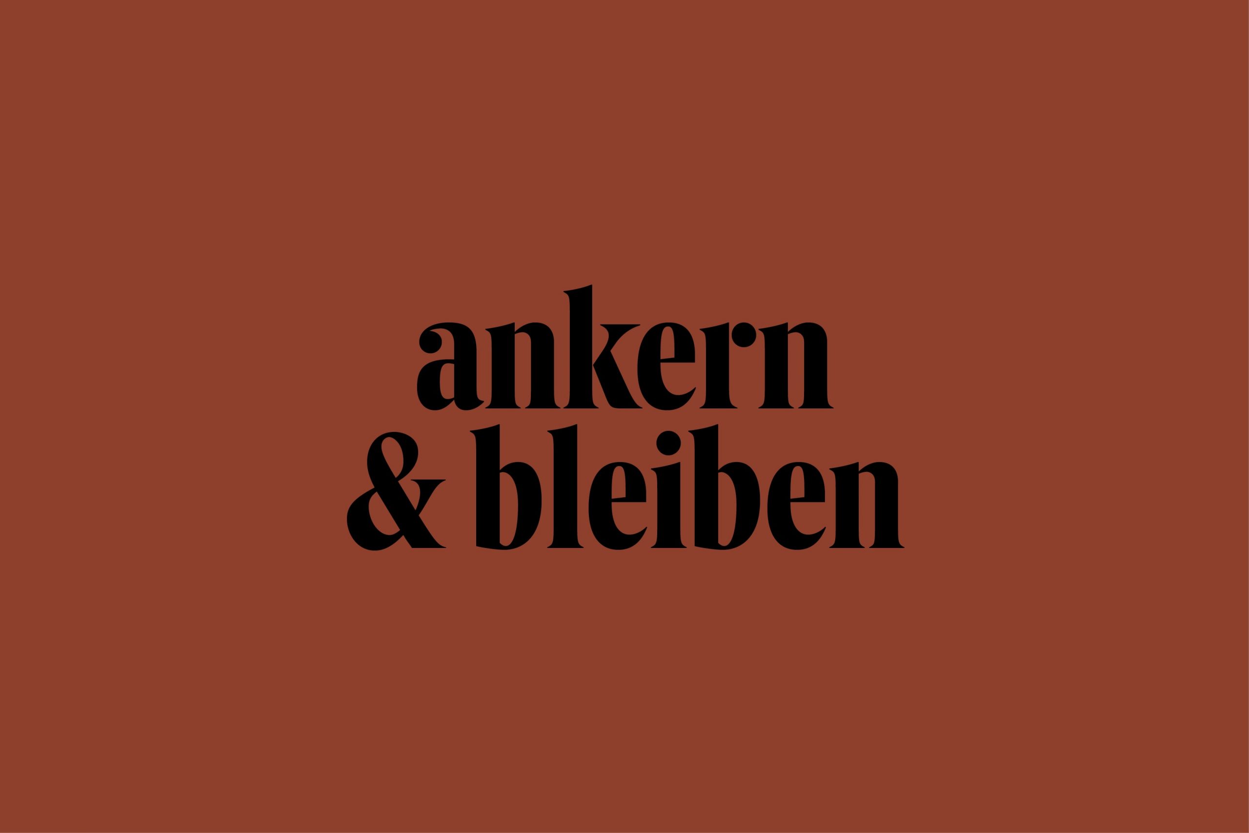
The word mark and the signet of the Flößerhof form the fixed points of the brand development. The color concept is derived from the high-quality red brick, which radiates warmth and reliability and at the same time contextualizes the historic industrial culture at the harbor. Individually, friendly, of high-quality – these are the core elements of the brand and thus of the new living-lifestyle product.


Brochure, folder and floor plans
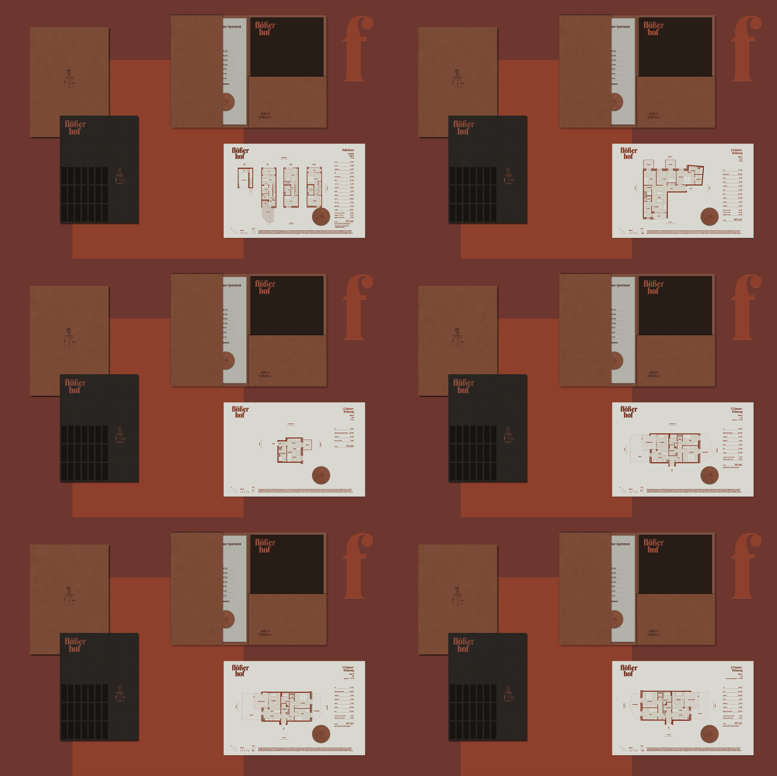
Matching the interior design of the apartments as well as of the exclusive three harbor houses, the sales materials have a special quality and a haptic feel. The sales brochure, made of fine manufactured paper with blind embossing, is handed over to the customers in combination with the individually designed floor plans in a tailor-made folder with hot foil embossing.


Onepager
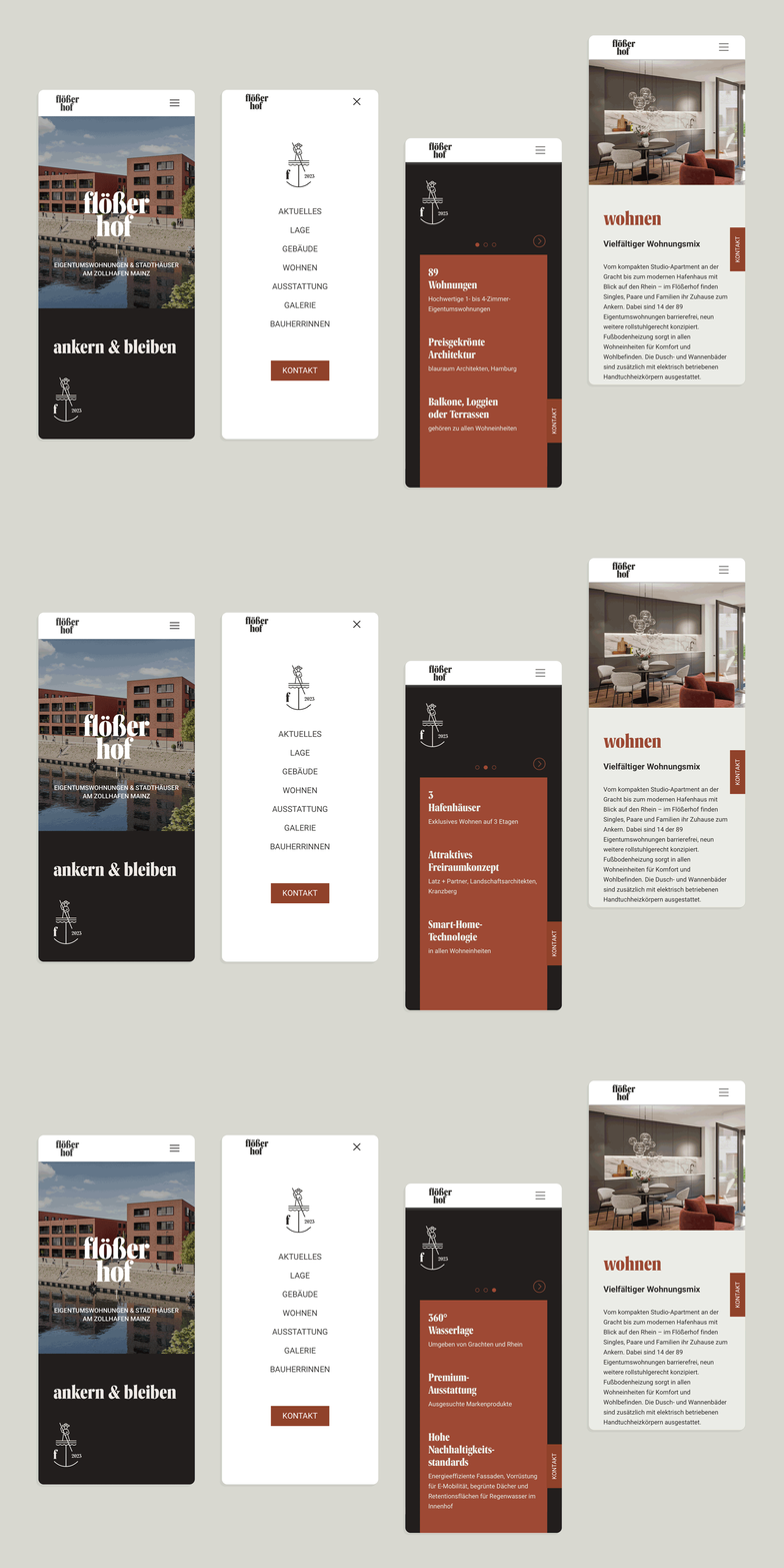
The website of the Flößerhof is designed as an one-pager. The user is being presented the story and the product of the Flößerhof clearly, compactly and in a contemporary UX/UI design. Navigation and so-called pagejumps allow the user to navigate to a particular chapter. An animated visualization in the intro creates the feeling of living at the harbor.
