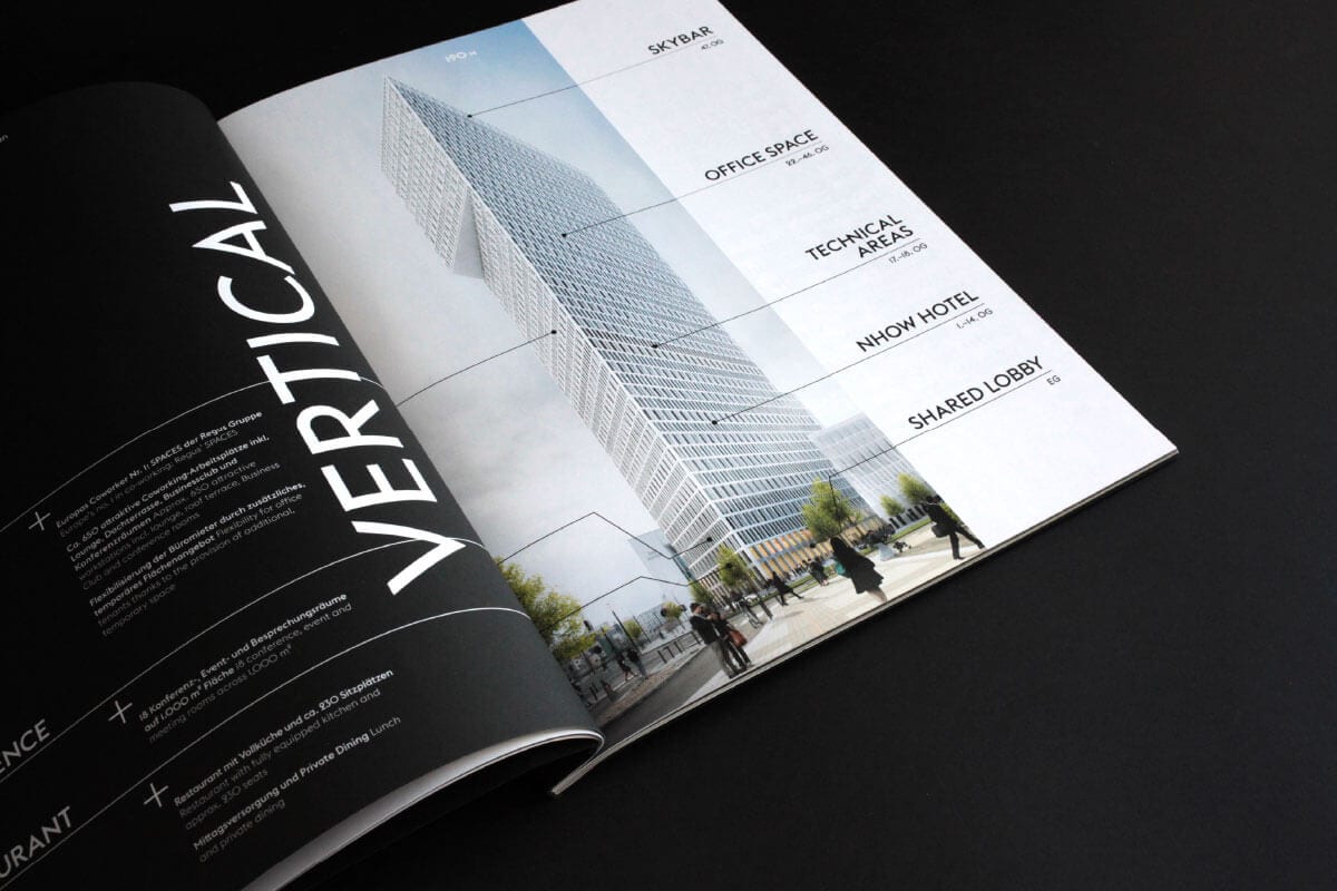
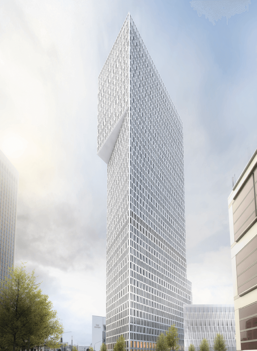
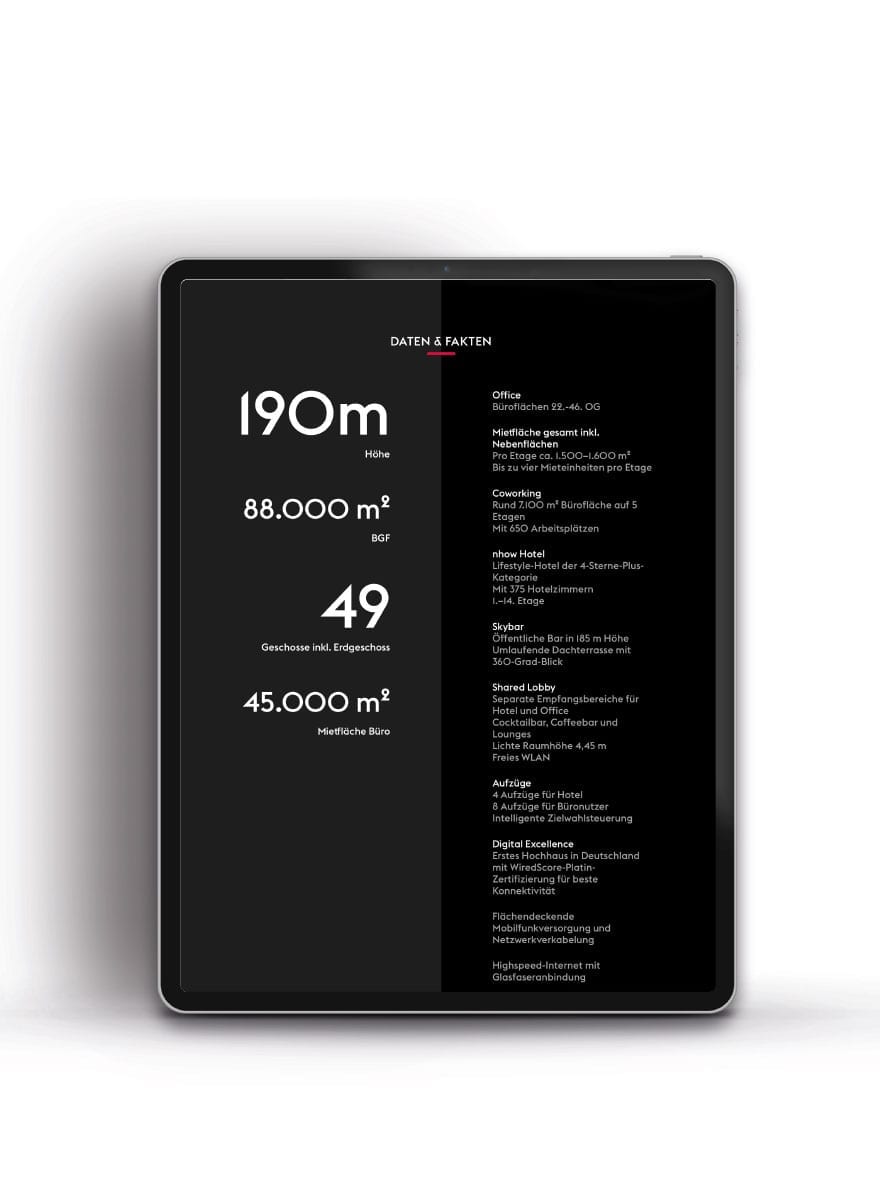
The ONE by CA Immo mixed-use high-rise is currently under construction between the western banking district, the trade fair centre and the Europaviertel in Frankfurt. Project developer CA Immo is building the 190 m high tower according to the designs of Meurer Architektur + Stadtplanung. ONE will be realised as ONE VERTICAL CAMPUS, which combines the uses office, coworking, hotel, a public skybar, gastronomy, conference and a lively and shared lobby. ONE is also the first building in Germany to be awarded the Wired Score Platinum certificate. The developer's objective and acre's task was to position ONE as a building that represents openness and a benchmark for connectivity and agile work. This goal was achieved by creating a distinctive brand identity, an integrated marketing campaign across all stages and creative storytelling.
mehr
- Type of project
- Mixed-use high-rise
- Location
- Frankfurt/Main
- Client
- CA Immo
- Discipline
- Brand Name Development, Branding, Corporate Design, Brandbook/Spacebook, Website, Construction Site Hoarding, Brochures, T-Shirts, Teaser Clip, Folder, Poster, Floor Plans


Philosophy
The manifesto of the ONE GOOD IDEA became the key message of the ONE during the first teaser phase. The self-confident statement conveys the work and lifestyle attitude of a new generation of users and thus presents ONE as the ONE GOOD IDEA to share in the future.
Poster
To draw the attention of potential tenants and multipliers to the new product for the first time, acre developed the ONE LIFESTYLE poster. Without losing many words, it includes ONE in the series of everyday favourites of a fictional, contemporary and very agile user.
TEASER CLIP
As an intro to meetings and presentations to potential tenants and brokers, a clip was produced. The philosophy was told as an off text alternately by a female and male speaker, while on the visual level the masked characters and typographic fragments from the core messages interact. The teaser CLIP generated a lot of attention and curiosity about the product and enabled an emotional opener to every meeting.


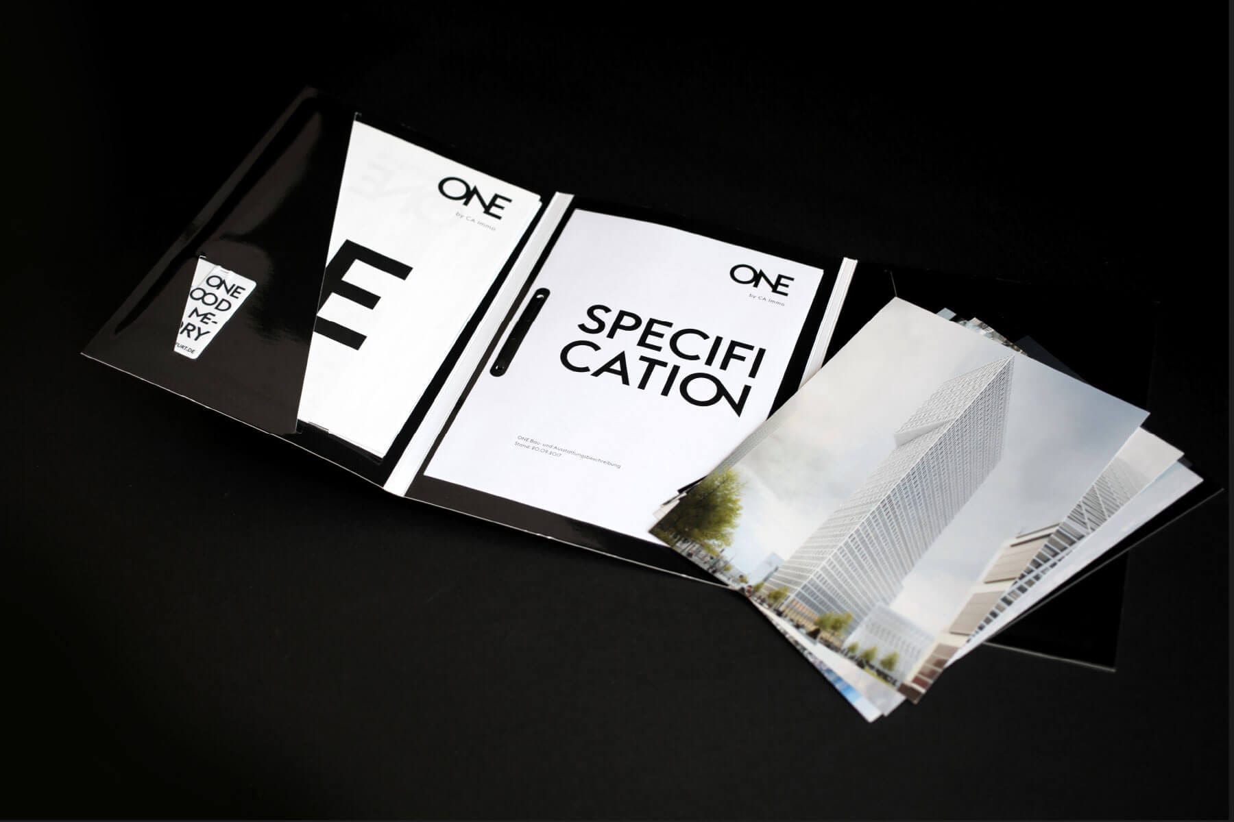
ONE PACKAGE
The poster series of ONE communicates three possible planning options for a typical floor plan in ONE in a compact and cool way. With striking brand messages on the back, the posters became wall art in some offices of future users. In order to hand over a compendium of posters, individual floor plans, building specifications and latest renderings to potential tenants, acre designed a six-page folder including pockets and a filing function as well as an insert tab for the ONE GOOD MEMORY CARD.


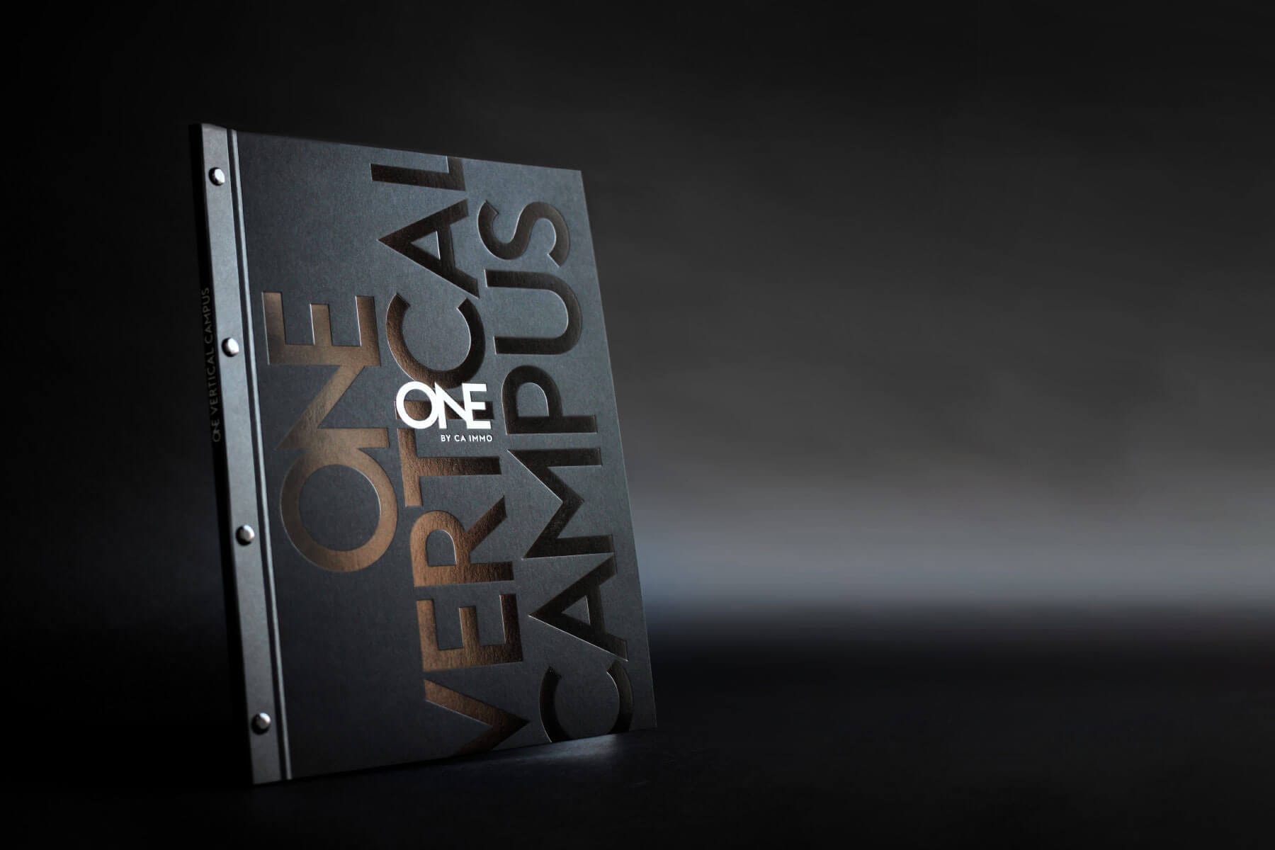
ONE SPACE BOOK
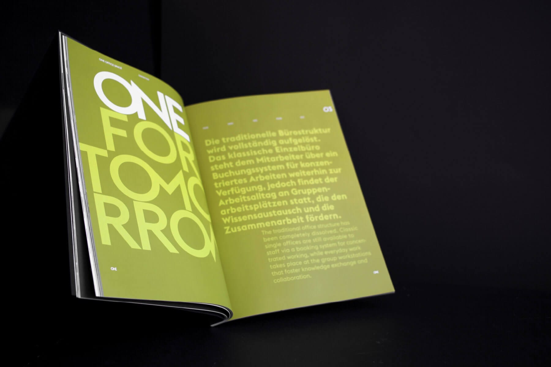
The lavishly produced ONE SPACE BOOK is a hybrid of magazine, trend book and space study in cooperation with furniture and furnishing company VITRA. In addition to presenting the building and its mix of uses, it contains interviews with the architects and trend researchers on the subject of new work. In addition, it shows the variety of possibilities for interior designing the office space in ONE. The communication of the three space concepts ONE FOR TODAY, ONE FOR TOMORROW, ONE FOR TRADITION is a central aspect of the BOOK. The division is supported on the haptic level by specific effects such as shortened pages or the changing from high-gloss pages with a relief varnish finish to uncoated paper.


ONE is a bold commitment to the diversity of work places and mixture in everyday life.
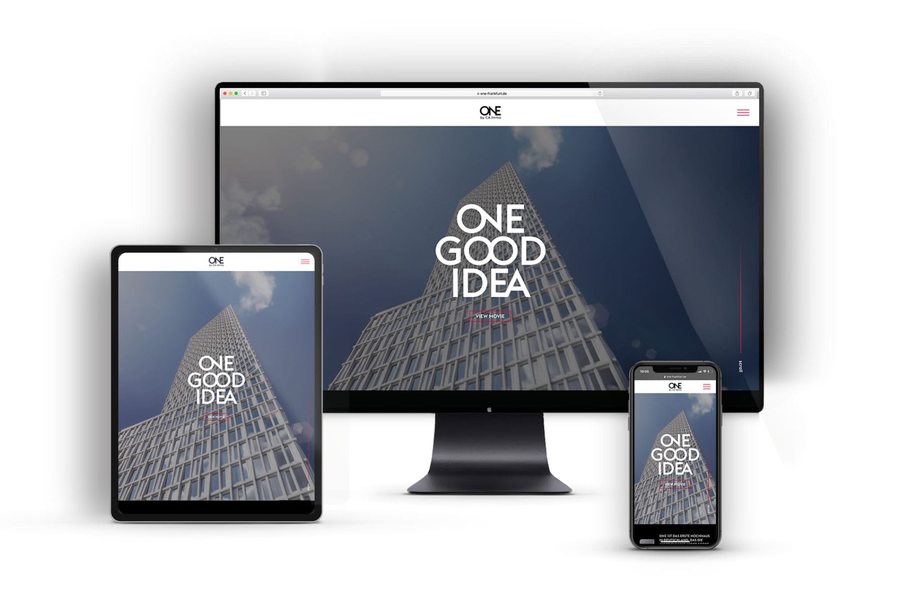


Search engine optimized website
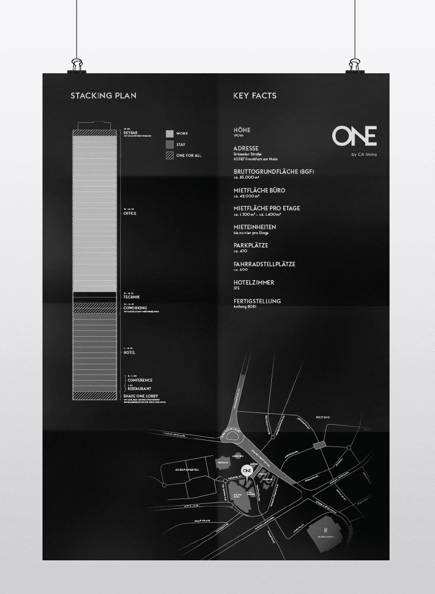
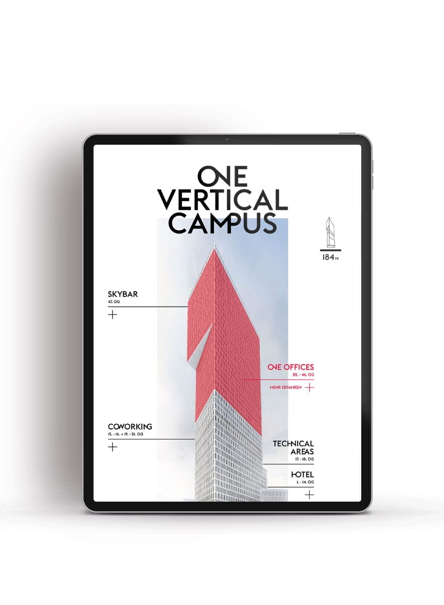
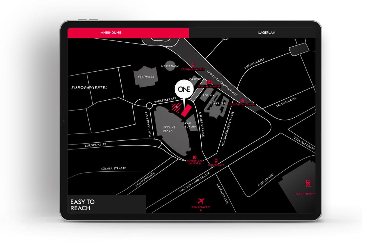
With the comprehensive project website developer CA Immo presents all relevant information packed into an exciting user journey. The most important information such as the mix of uses, architecture, technology and equipment, location, floor plans, webcam of the building process and news are presented clearly and at the highest technical level. The bilingual, responsive website is search engine optimized and developed in CMS WordPress. The client is thus able to keep the content of the site up to date at all times. Gadgets such as an animated stacking plan including altimeter, the embedding of clips as well as parallax effects, developed in state-of-the-art programming, enable a vivid user experience as well as fun while navigating and discovering the ONE website.
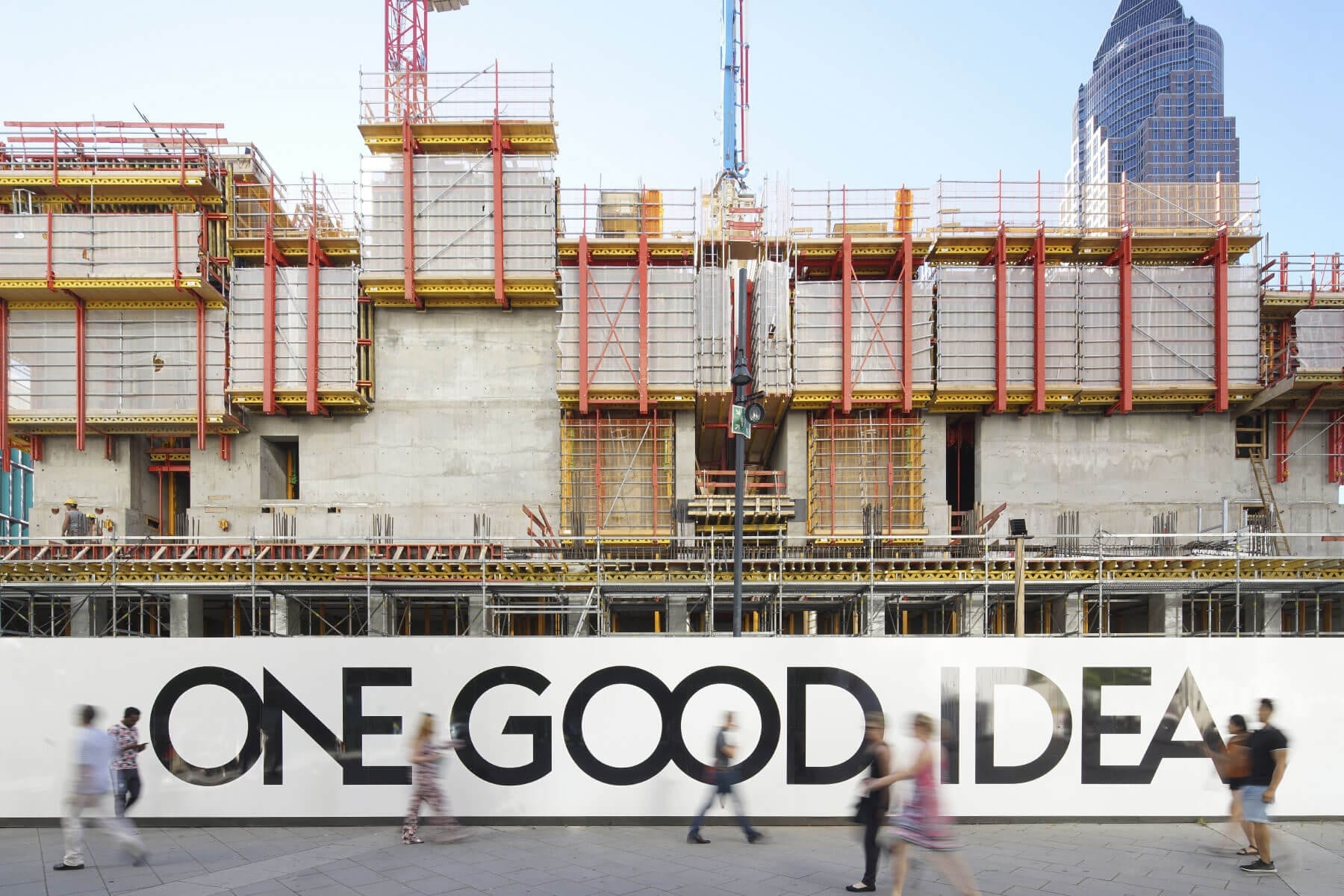

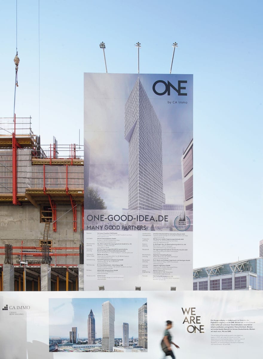


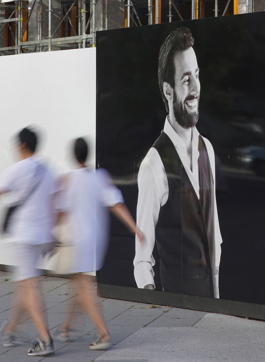
Construction site marketing – make it bold
The interaction with target groups, multipliers and the public is also continued at the ONE construction site – thanks to a branded construction sign, climbing formwork and more than 400 metres of construction site hoarding. Striking messages, information areas, high-quality branding with milled 3D logos and cut-out images on aludibond forms now transfers the expressive branding into the public space.

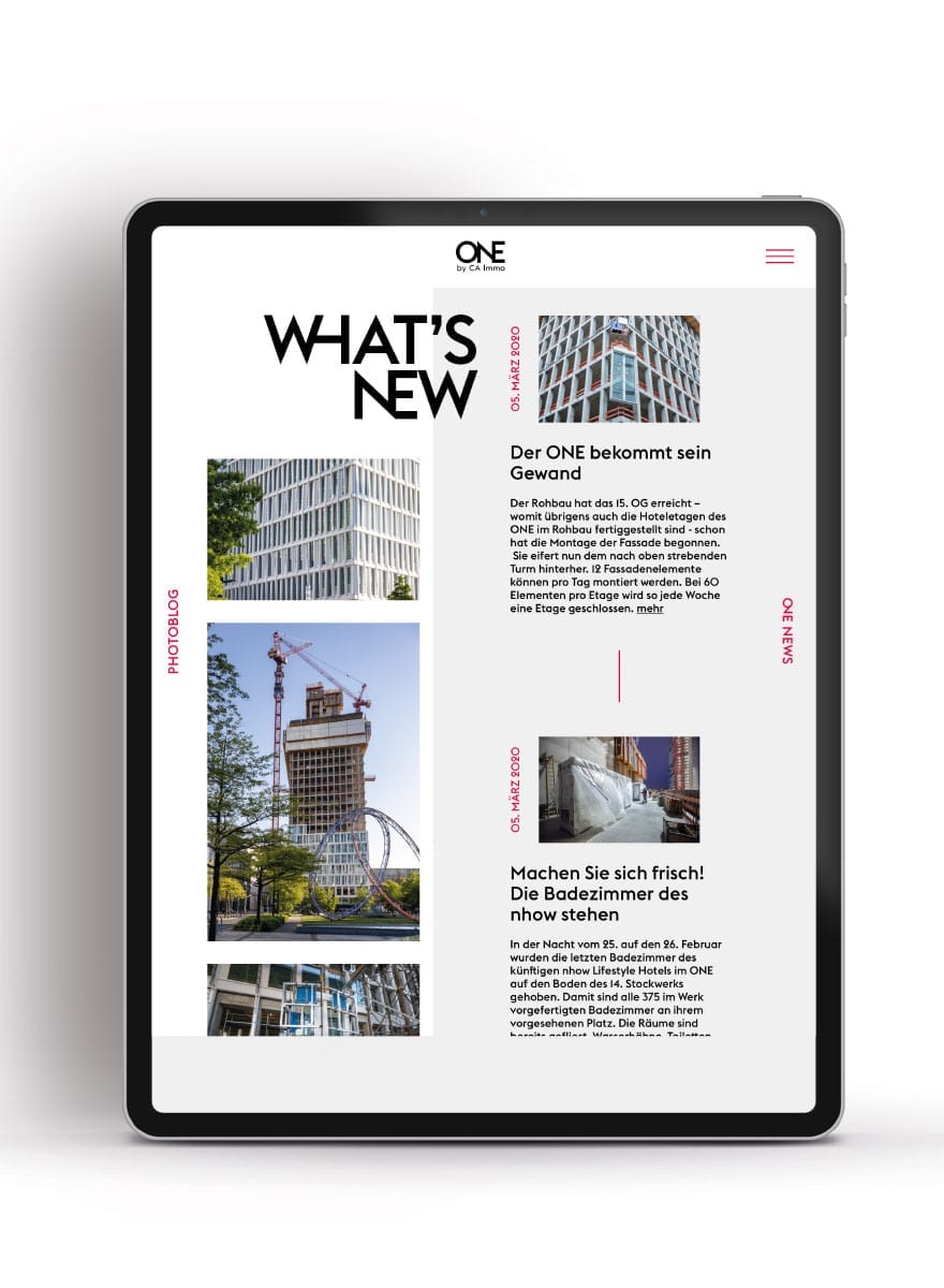
Blog & Social Media
In addition to the news and photo blog on the website, which regularly provides new impressions of the construction process and news about the ONE, the social media presence extends the reach and interest group to the general public. The Instagram account provides the link to the news blog on the ONE website, thus offering both communities expanded information options.


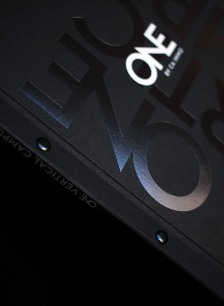
Supersize – the sales brochure
In the main marketing phase, the core messages and the latest development status of the building were to be summarized and structured once again in a convincing print product. With the help of a flexible binding the brochure doesn’t remain static, but always keeps its finger on the pulse. The ONE aesthetics was further developed and realised in an elaborately produced, large-format softcover booklet. Various special solutions in production, such as the solid black-coloured cover with superimposed hot foil embossing white on black, as well as the change of paper from coated to uncoated as well as different page formats inside, create a haptically and visually exciting product that users like to use again and again.