Showroom & branding
The office building on Niederkasseler Lohweg 181/183 (NKL) in Dusseldorf is an impressive portfolio property owned by Credit Suisse. In order to provide new stimulus to the marketing of the large-size building in the so-called Seestern office quarter, client Credit Suisse asked acre to develop creative short-term measures, aimed at giving potential tenants a better impression when viewing the spaces on site and enhancing marketing collateral in particular. acre developed a visual language for NKL’s corporate image as well as an interior concept for the showroom on the 2nd floor of the building. Also, the re-design of marketing collateral provided for a coherent brand identity as part of a set of focused marketing measures.
mehr lesen- Type of project
- Office building
- Location
- Dusseldorf
- Client
- Credit Suisse
- Disciplines
- Positioning, design concept, showroom design concept, branding/graphics showroom, letting teaser, floor plans

Design / branding
By choosing the distinctive Separat type we defined a signature project font which combines straight and curved lines and as such reflects the striking form of the NKL building.
The colour scheme uses a bright blue and subdued shades of white, black, grey, and beige.


Teaser
The concise marketing teaser in the form of a bold presentation conveys the property’s qualities by using new pictures of the building and the showroom. The ‘Haus von Format’ (building of stature) becomes accessible to potential users by exploring the newly designed floor plans and all relevant in-depth information.

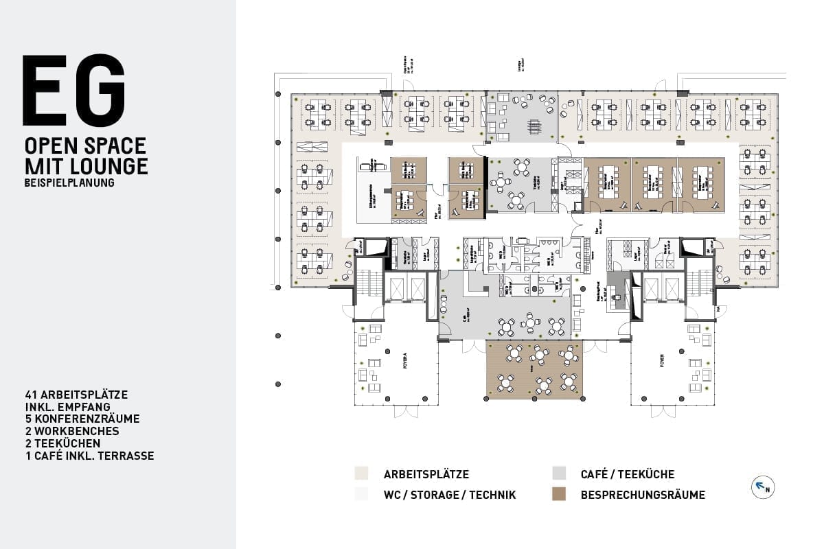
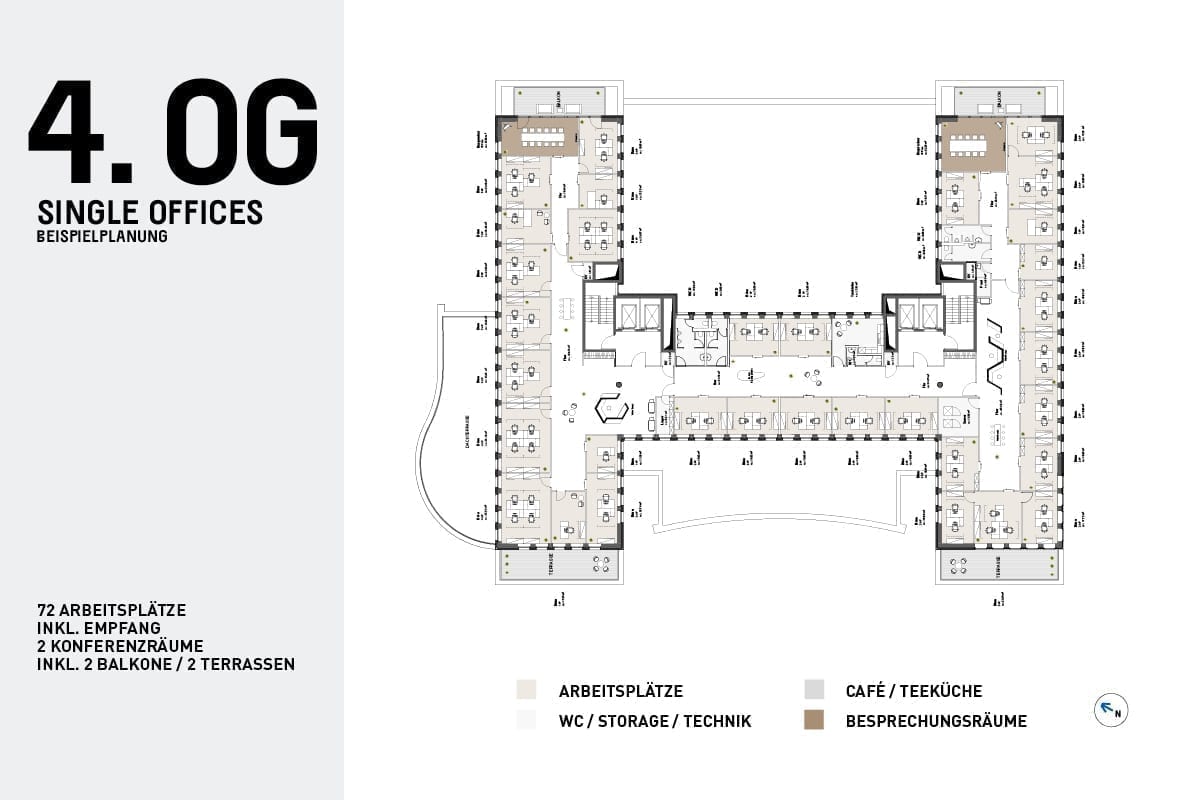
Floor plans


Design is thinking made visual.

Showroom concept and realisation
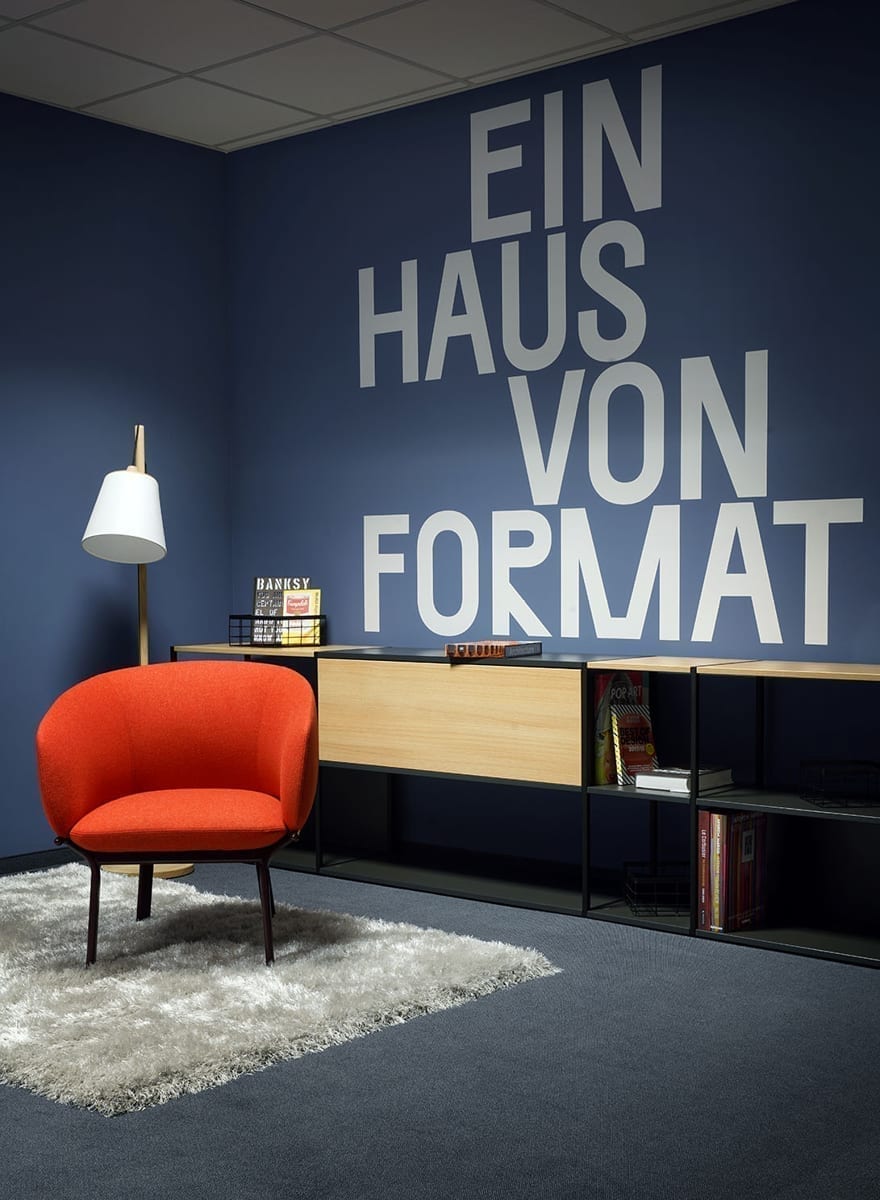
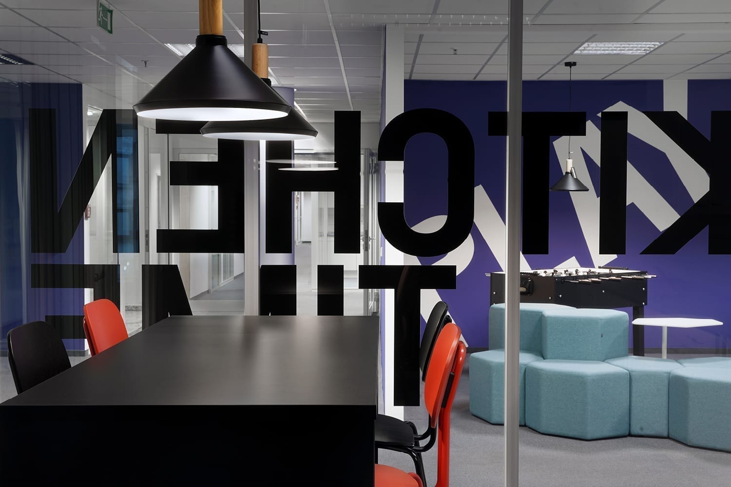
To provide a tangible experience of NKL’s qualities and flexibilities to potential users, acre designed a comprehensive showroom concept, including kitchen, open workspaces, welcome lounge, cloakroom as well as a work & play zone for balance and inspiration. The combination of modern furniture, a well-balanced colour scheme based on the project’s brand design an a wall decor comprising brand messages, floor plans and photographs of the building created an appealing integrated concept, which inspired potential users and had a positive impact on the marketing of the spaces.


Branding showroom
Various brand messages, typeset prominently using the project font Separat, highlight the brand image of the building and establish a relationship between the showroom’s interior and the building itself.