KOMM –
” restcontent=”In this context, acre was commissioned to reposition the KOMM in order to increase the visibility of the center and to strengthen the image as an attractive, contemporary commercial property. In the execution, our analytical-strategic work resulted in a redesign of the appearance and its implementation in various tools.”
- Type of project
- Shopping centre
- Location
- Offenbach
- Client
- Portus Retail
- Disciplines
- Strategy, repositioning, redesign logo and identity, claim, imagery, digital leasing presentation, signage, poster, design concept shop windows, Newsletter during renovation


Redesign KOMM
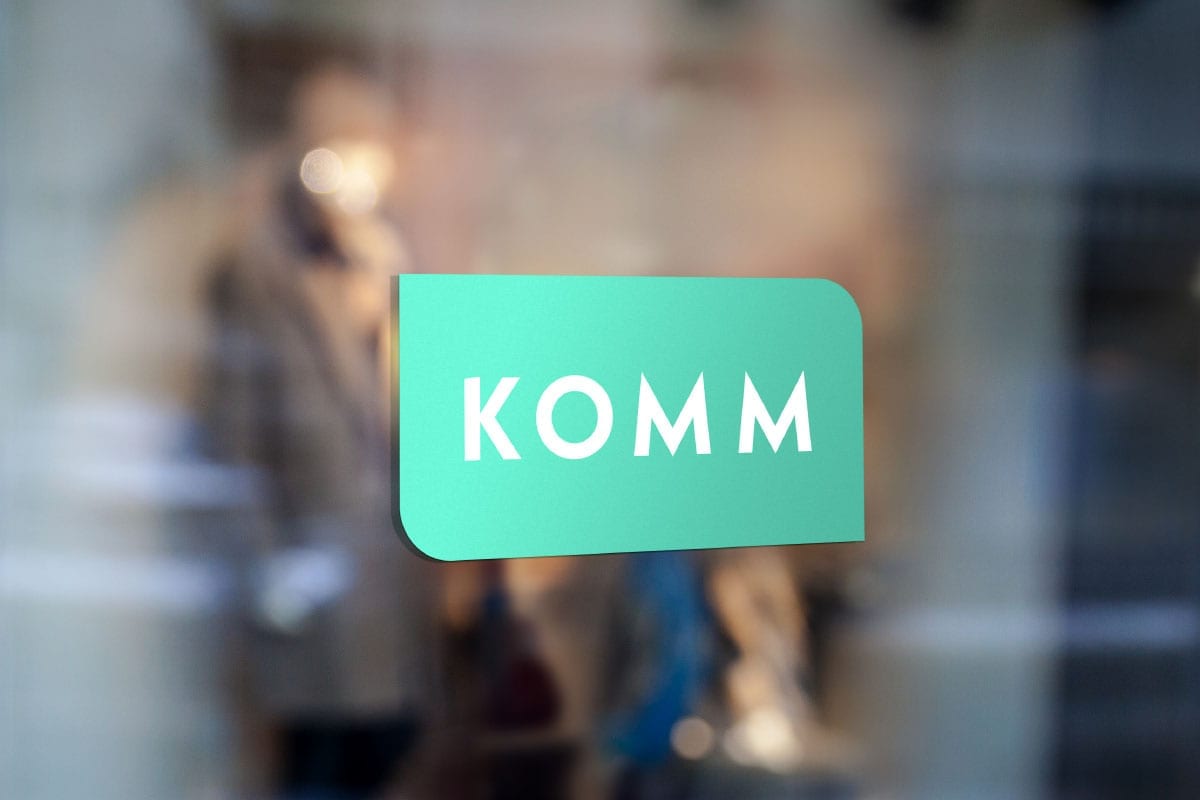
The aim of the redesign was to simplify, modernize and profile the appearance. We freed the letters from the frames surrounding them and placed them on a background shape that quotes the protruding, curved windows that form a striking feature of the building. As the brands typeface we chose the new edition of the famous Kable, which was designed by Rudolph Koch in Offenbach in 1927 and was redesigned by Marc Schütz in 2016. We reduced the variety of green and blue tones to a lively, harmonizing green, which is mainly combined with white and black. Creamy yellow and red provide matching accent colors. The result is an appealing appearance expressing clarity, openness and timelessness.


The newly designed digital marketing presentation contains all important key figures and arguments to win retailers for the new KOMM. The newly developed image concept strives to standardize the style in terms of light, color and framing. In addition to the visual concept, the linguistic concept, in which the name KOMM becomes the start of a brand message, creates a closeness to the target groups.


The new image concept on the facade


The Newsletter informed during the renovation


