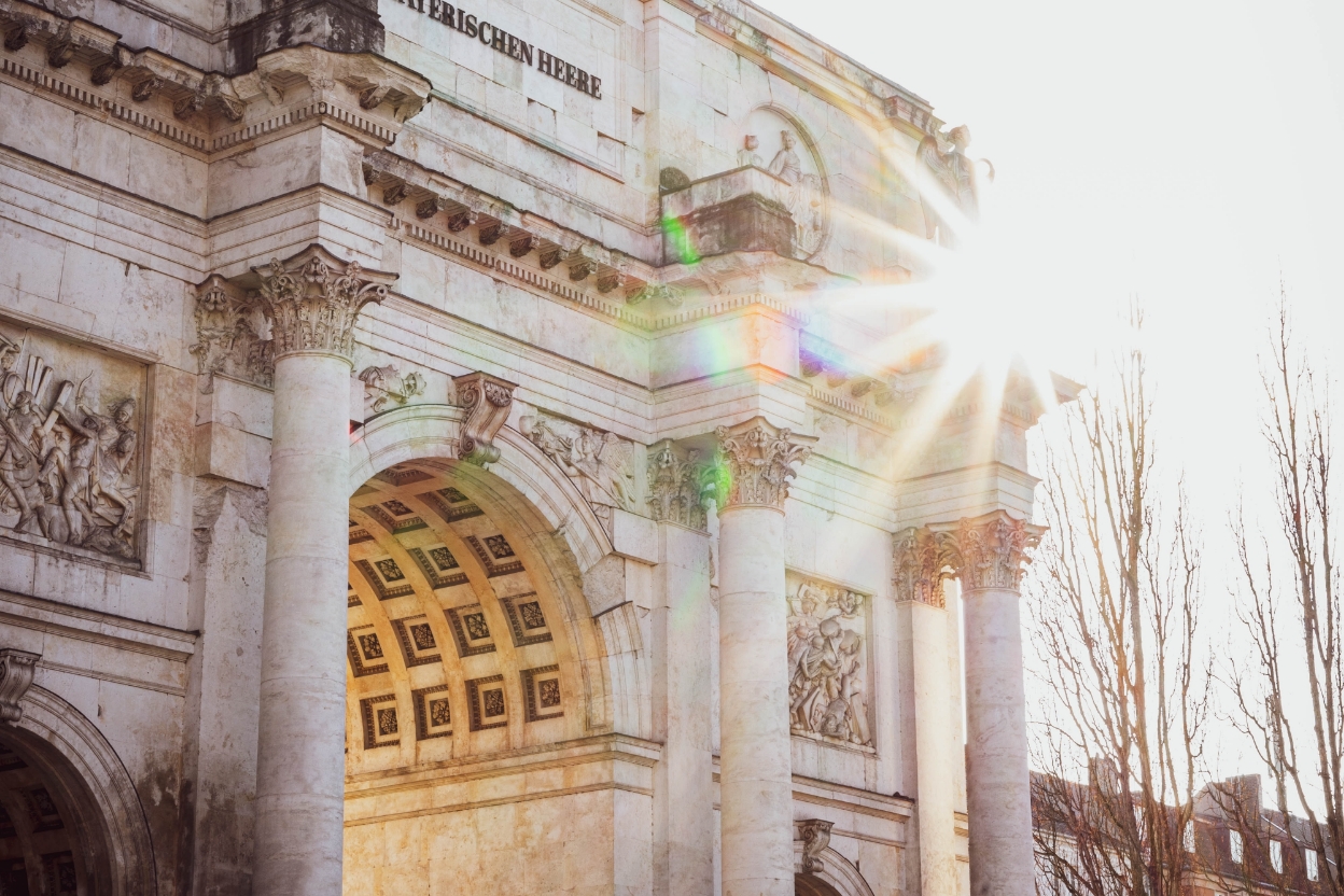
- Type of project
- Office building
- Location
- Munich
- Client
- ABG Real Estate Group
- Discipline
- Communication concept, brand development, branding, construction site communication, marketing brochure, website including Google Ads campaign.


The wordmark
The wordmark FRANZ refers to the facade design. The window bands of the revitalised, listed facade highlight the horizontal and thus break away from the common facade design of the surroundings. The initial letter F is also consequently stretched and thus breaks with visual habits. Like the original, the FRANZ brand is idiosyncratic and individual.


The cult – the history
FRANZ is an homage to a renowned Munich eccentric and a German TV and pop culture icon of the 1980s: “Monaco Franze – der ewige Stenz*”. In the eponymous series shot by the Bayerische Rundfunk, the Bavarian Broadcasting Corporation, the building at Sonnenstrasse 20 attained nationwide fame. Monaco Franze, played by Helmut Fischer, ran the „Monaco Detektei für Ermittlungen und Beobachtungen aller Art“ (Monaco Detective Agency for Investigations and Observations of All Kinds) at Sonnenstraße 20. The FRANZ brand identity refers to the 1980s cult series „Monaco Franze“ and, with the new positioning THE SIGNATURE OFFICE, also introduces a new chapter for the property: as a representative office for the entrepreneurs of tomorrow and lovers of urban life.
*Source: https://www.br.de/br-fernsehen/sendungen/monaco-franze/index.html


The man in the black hat
The signature look of the 80s „Monaco Franze“ included a trench coat and a black hat. We tell the story of the new FRANZ by retelling the iconographic image of the man in the black hat in a contemporary visual language and with individual motifs. FRANZ thus becomes (once again) a cult figure of the present and the future, roaming through urban Munich and cultivating working in a new way.


Website
Finally, the holistic FRANZ brand identity unfolds on the website. The home page with its concise key visual and logo captivates users. FRANZ seduces with discreet parallax effects to explore the philosophy and finally the other main pages, which are teased via a scroll animation on the home page.
In addition to the history, high-quality 3D visuals and a detailed description of the location, users can find out all the interesting facts about the office spaces on the responsive website.
Informative and idiosyncratic
The hat key visuals introduce the main pages THE HOUSE, THE LOCATION, THE OFFICE ZONES. The web design is clear and concise and ensures easy handling by the user. On the location page, some of FRANZ‘s most popular top places are compiled – a small individual mix of Munich insider tips that makes you want to explore them and tells you about the advantages of FRANZ‘s location with a personal touch.

Construction site communication
The striking and consistent design of the building site in purist light pink with dark typography has a modern and contemporary effect and, in combination with the use of the colour on the website and in the brochure, has a high recognition effect. FRANZ visibly beautifies the cityscape for all drivers and passers-by even during its construction phase and refers to a new urban family member.


