
With the nine six-storey apartment buildings, Deutsche Wohnwerte created the first freehold flats on the harbour island at Hafen Offenbach – and a completely new quality of life. acre was involved in the product development process at an early stage, so the Hafengold brand we developed became a guidepost in shaping the architectural concept. Thanks to the successful implementation of a holistic, cross-media branding, the high-quality residential product was completely sold out even before its completion in 2016. Hafengold set a new benchmark for urban living on the waterfront in Offenbach and continues to shape the positive flair of the Hafen Offenbach micro-location to this day.
read more- Type of project
- Residential property
- Location
- Offenbach am Main, Germany
- Client
- Deutsche Wohnwerte
- Disciplines
- Strategy, product development, name, brand identity, brochure, teaser, website, PR, branded space, construction site signboard, gift for buyers, advertisements, signage


The brand
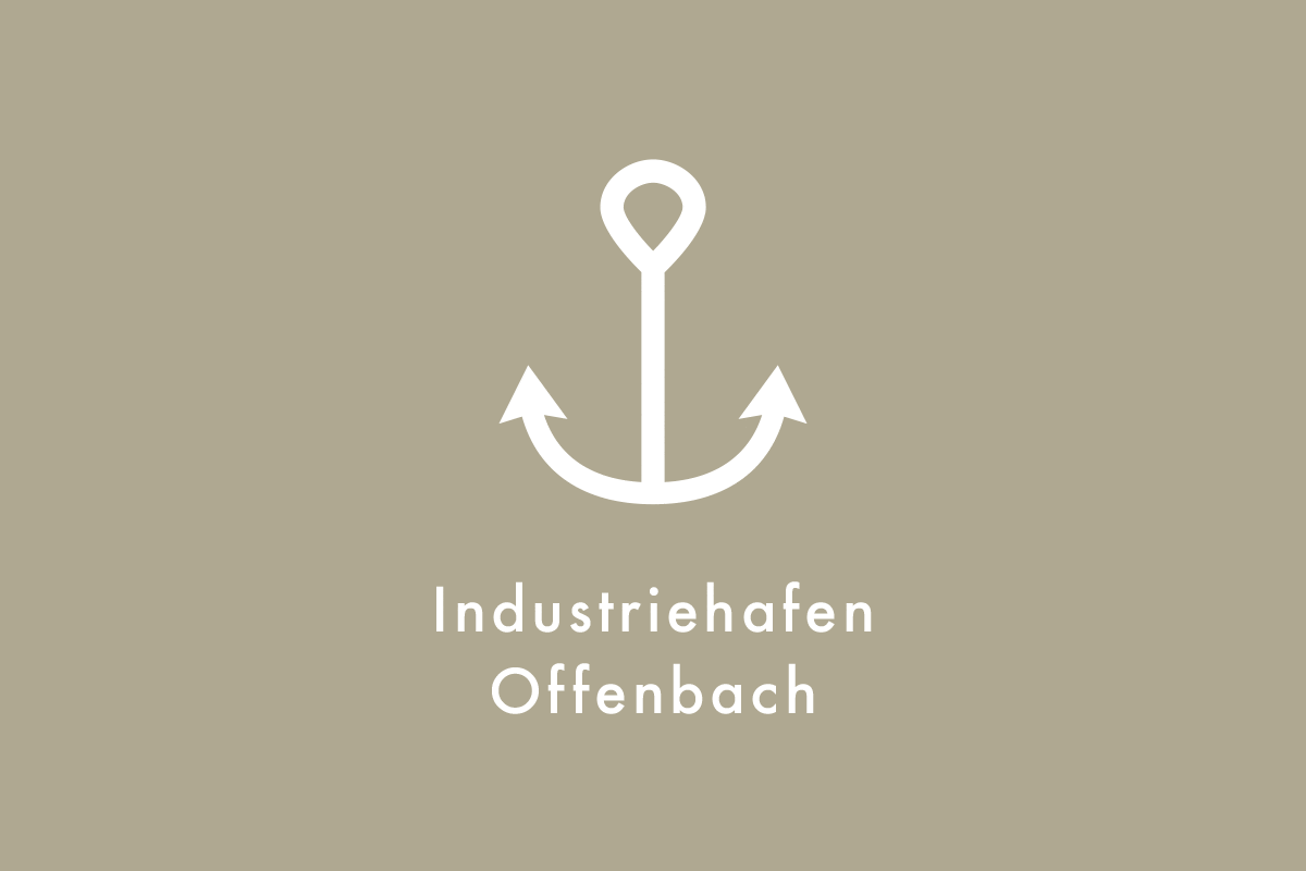
The name “Hafengold” (translating as “harbour gold”) creates a reference to the genius loci, to the location directly on the harbour square in the heart of the Offenbach harbour, addresses the original, the history of the place, but also the arrival in the “home port”. The “gold” conveys the high value of the residential ensemble and the quality standards with which it was developed. The word creation thus reflects the contrasts that form an exciting symbiosis in the architecture: rough, smooth, industrial, sensual – valuable.
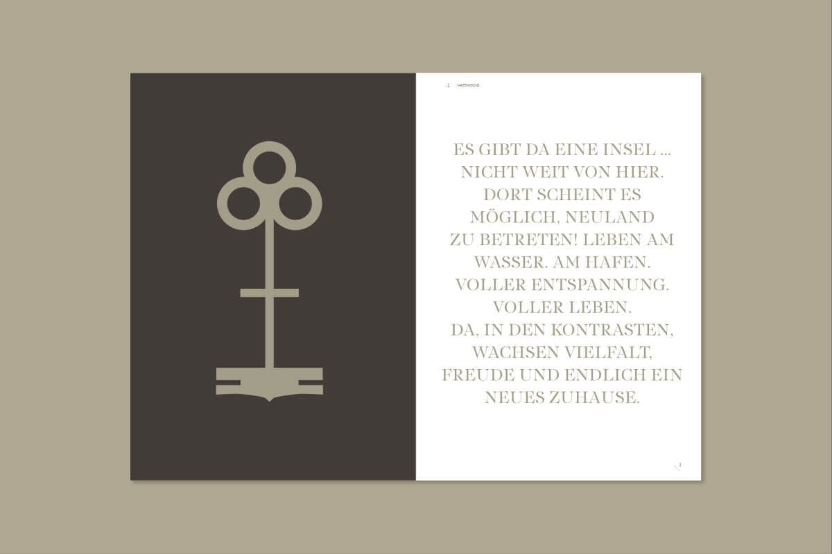
This complexity is also expressed in Hafengold’s signet: the anchor as a symbolises the harbour, the waves the property’s location on the water, while the number 9 stands for the nine “island houses” and the oak leaf for the connection with the city of Offenbach.
The design language is also a play of contrasts: design elements related to the theme of shipping, maritime patterns, a fresh blue colour and grey hues that evoke the rough, industrial character of the harbour, refined with gold in print products. The sans serif typeface Futura std. is a modern classic and strongly inspired by Bauhaus. Sharp, geometric and timeless, it forms an exciting contrast to the lively and sweeping serif typeface PF Regal Finesse Pro with its sophisticated and luxurious feel.
„Home is where my Hafen is.“


The communication concept
From the marketing suite to events, merchandising products, pitches to VIP clients in the pre-sales phase, PR campaigns, construction site communication and advertising to high-quality print products as well as a representative website – thanks to finely coordinated online and offline measures, a strong customer journey was created that reflected the identity of the product and convinced potential buyers with consistent branding.
Marketing collateral


Floor plans

Website

Construction site signpost

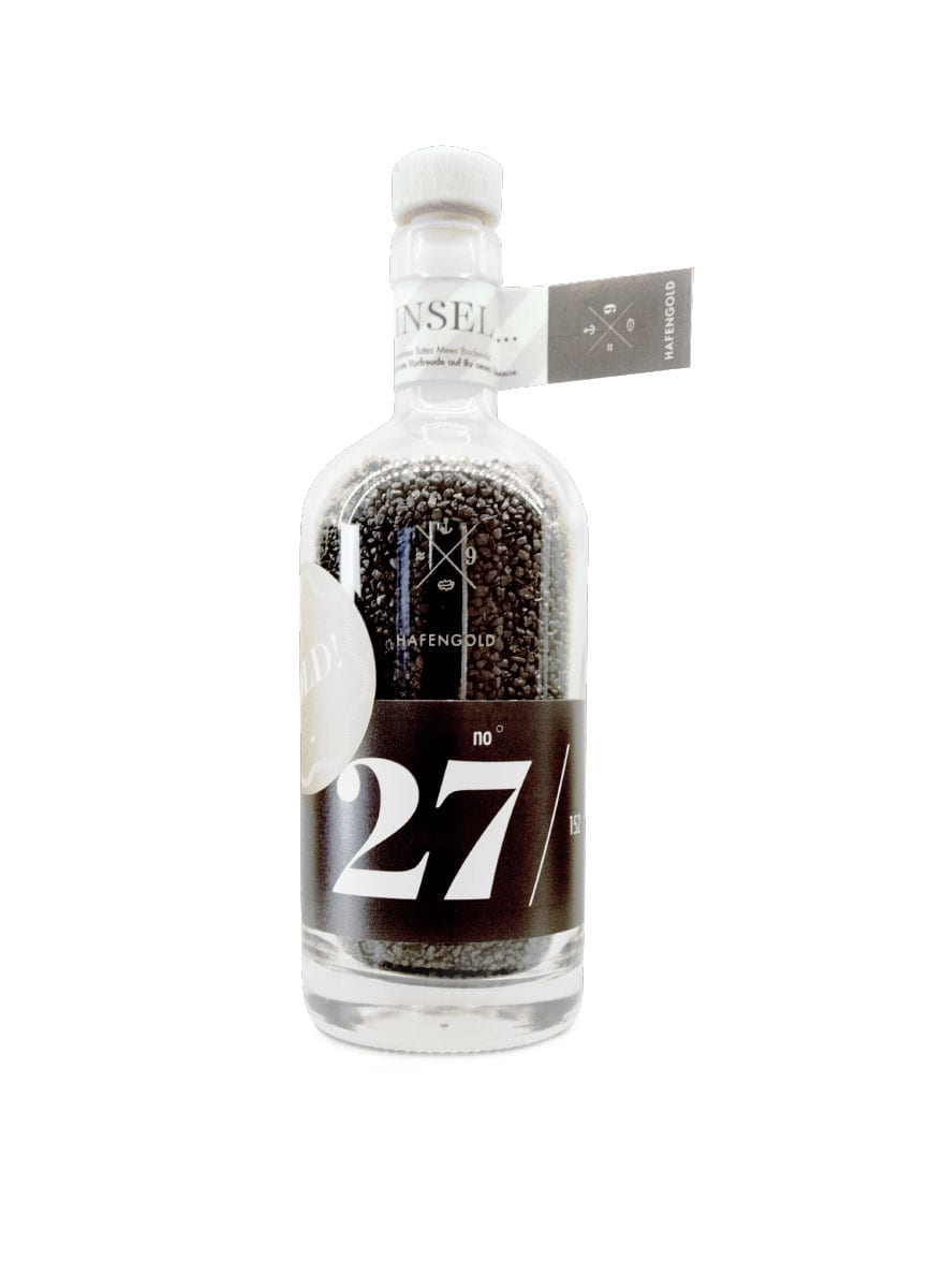
Showsuite / message in a bottle


Signage


Advertising

